A website built by AI in 5 minutes: why it ends up being rebuilt
Every couple of weeks someone sends us a link with “we already have a site, an AI made it, we just need to connect the domain and do SEO”. Almost every time, it turns out a bit more is left. Here's what exactly, and when a rebuild isn't necessary.
 Shahzodjon JumakulovFrontend developer
The latest case was in March. On a call, the client opened his laptop and showed me the site: a big headline, a gradient, three cards with icons, testimonials, a "Contact us" button. All neat, everything in place. He'd put it together in one evening with an AI site builder and was genuinely proud of it.
I opened the same site on my phone. The menu covered the headline, the cards ran off the edge of the screen, and the "Contact us" button led to a form that didn't send anywhere. The testimonials came from people who don't exist: the builder had generated those too.
I'm not against these tools. I use AI every day myself. But between "looks like a website" and "works like a website" there's usually a week or two of work, and it's better to know that up front.
What people bring us
Builders like v0, Lovable and Bolt, and the AI modes built into Tilda-style services, got noticeably better over the past year. They nearly always nail the first screen. The problems start below it, and outside what you can see.
When someone sends us a site like this, I spend the first half hour going through the same list:
- Does the site open properly on a phone costing 300–400 thousand so‘m, not just on the developer's iPhone
- Does each page have its own URL, title and description, or is it one long scrolling page
- Can a search engine see the text, or is it loaded by a script after the page loads
- Are the Russian and Uzbek versions separate pages, rather than a JS text switcher
- Where do enquiries go, and do they actually arrive
- Can the owner change a price or a photo without a developer
- Where do the images and fonts come from, and can they be used commercially
- Are there any made-up testimonials, numbers or "certificates"
The problems almost always sit in the same items. Here are the main ones.
One page instead of a site
Builders love making landing pages: everything on one page, sections linked by anchors. That's fine for ads. It's bad for search: you have one page, one title and one description, while customers search for "henna nails Tashkent", "mehendi courses", "halal manicure". Each of those queries needs its own page.
Language on a switcher
This is the most common mistake in Uzbekistan. The site is built in Uzbek, and Russian is added with a button that swaps the text via a script. It's convenient for people. A search engine only sees the Uzbek version; the Russian one doesn't exist for it. And part of the Tashkent audience, especially on Yandex, searches precisely in Russian.
No admin panel
An AI builder hands you code, or a page inside its own editor. You can change a price in a 200-item catalogue there, but it's painful. A month later the business owner stops updating the site, and it starts lying: old prices, expired offers, staff who left long ago.
Example: the old Xina Soliha site
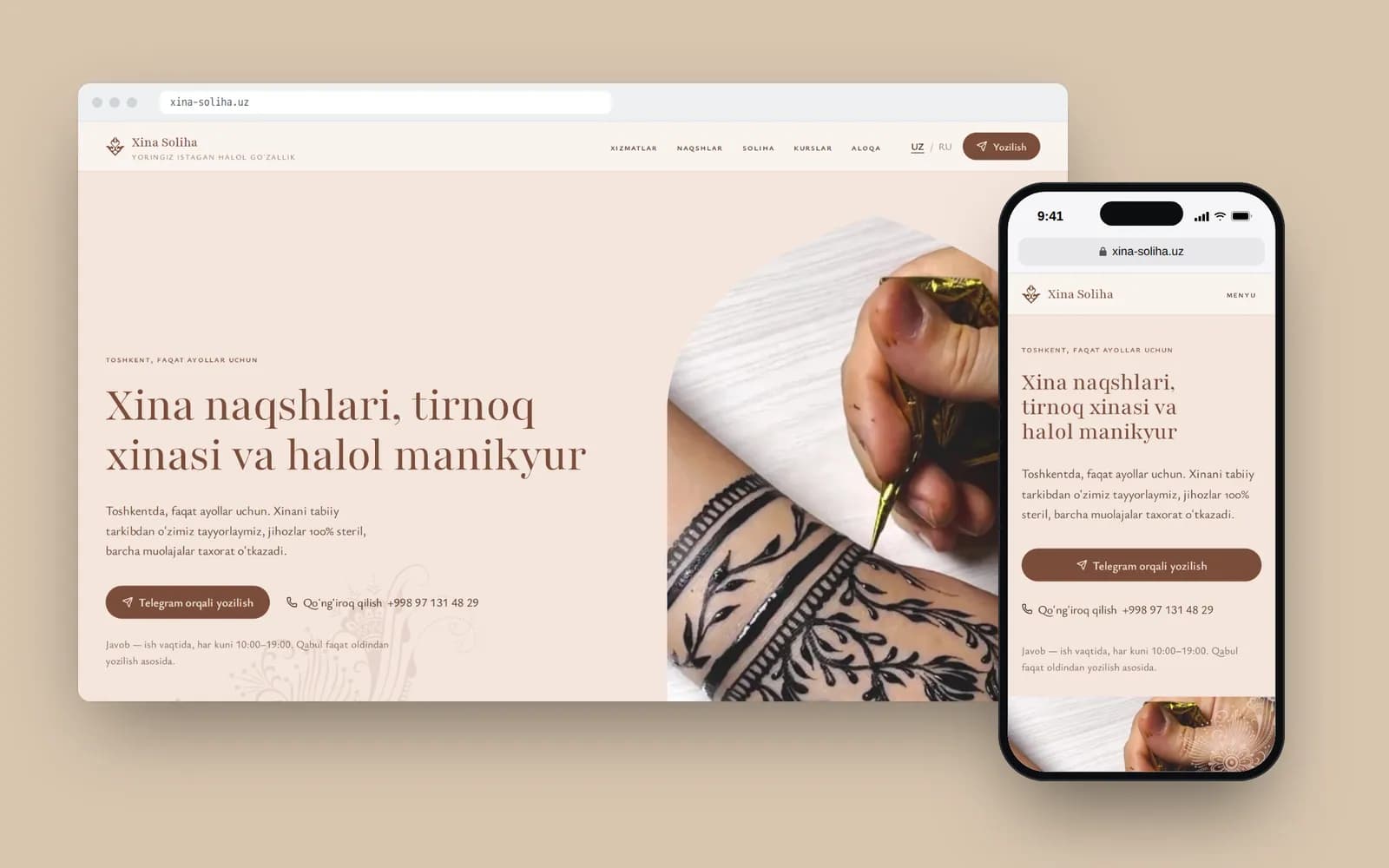
Xina Soliha is a women-only halal henna and mehendi studio in Tashkent with 24,000 Instagram followers. When they came to us, they already had a site: one index.html file and one stylesheet. I don't know whether a person or an AI made it, but structurally it looks a lot like what builders produce.
From the outside it wasn't bad. Inside, we found the following. The Russian version lived in data-ru attributes and was swapped in by a script at the press of a button, so search engines never saw it. The social preview image was set with a relative path, logo.png, so Telegram showed no image when the link was shared. The Telegram button pointed to a phone-number link that doesn't open for everyone. And there were no separate pages for services or courses at all.
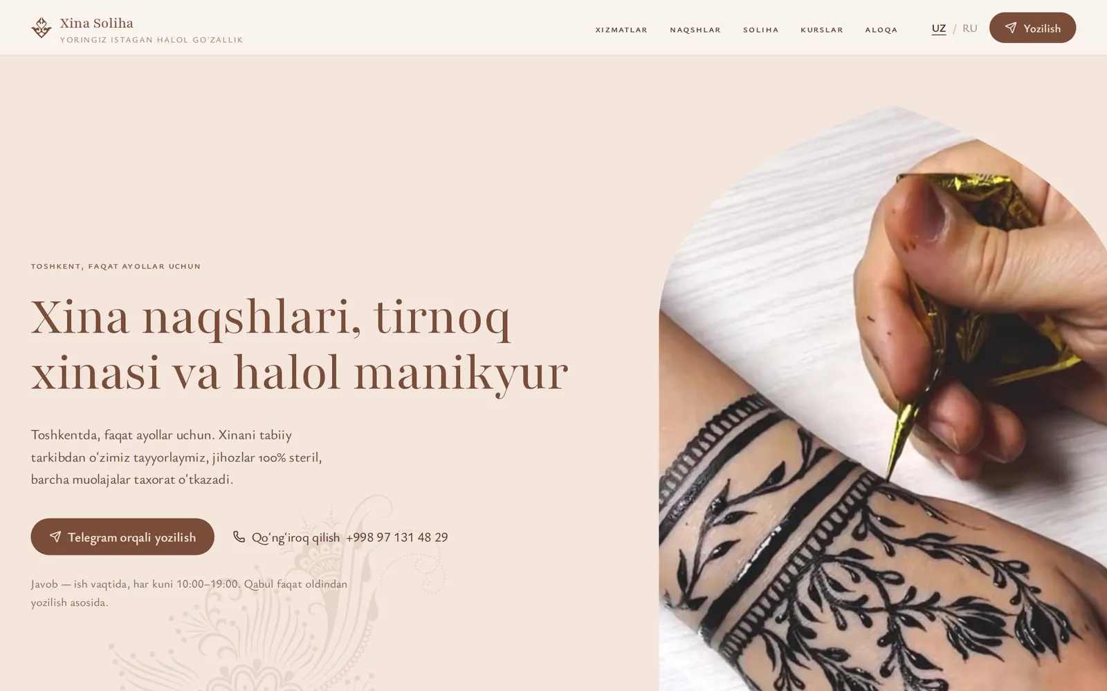
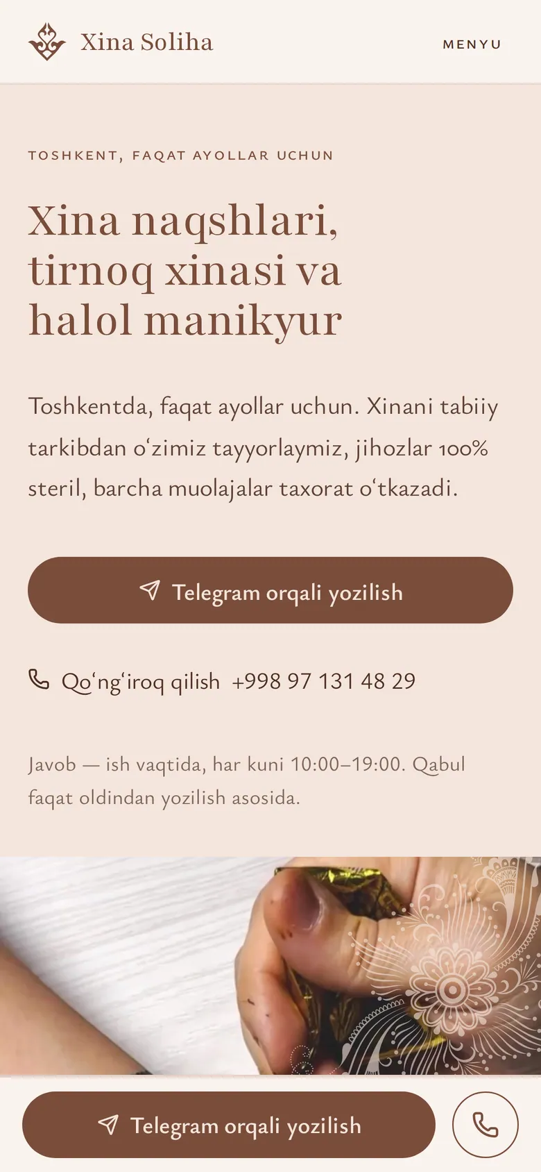
We built the new site on Next.js 16, and it's fully static: pages are generated ahead of time, so they open quickly even on weak mobile internet. Uzbek lives on the home page, Russian at its own /ru address, and every service has its own page. The "Book" button everywhere leads to Telegram with a pre-filled message, and on phones a Telegram bar is pinned to the bottom of the screen. The old domain redirects to the new one with a 301, so links already scattered across Instagram don't break.
Why it all looks the same
Builders have another problem: you can recognise their output a mile off. A purple-to-blue gradient, rounded cards with drop shadows, icons from one set, a headline like "Transform your business". Clients stop noticing it; buyers notice, even if only subconsciously. The site looks like a hundred others, and it earns less trust.
“A neural network draws an average website because it learned from a million average websites. A brand with a good logo and identity looks, after that kind of layout, as if it had neither.”
With Xina Soliha we had their own logo, patterns and photos from their agency, and we checked separately that the site didn't slide into a template: a light tone, restrained typography, no dark blocks back to back. Our spec literally had an item saying "the site must not look like an AI template".
Images and legal details
When a builder site is a perfectly good choice
I don't think a site like this always has to be thrown away. There are situations where it's a sensible choice:
| Situation | AI builder | Custom-built site |
|---|---|---|
| Test an idea in a week, run trial ads | Fits | Expensive and slow |
| One service, customers come from Instagram | Fits, once the mobile layout is fixed | Can wait |
| Need Google and Yandex search traffic for many queries | Poor | Needed |
| Catalogue, prices that change often | Poor, no admin | Needed |
| Two or three languages | Usually poor | Needed |
| Foreign partners, tenders | Risky | Better |
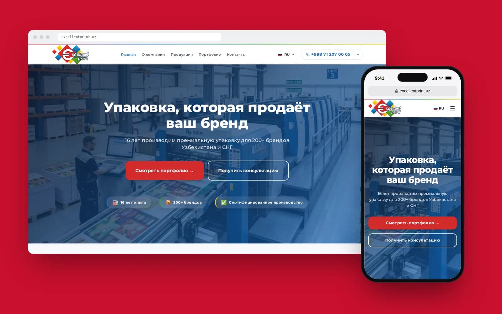
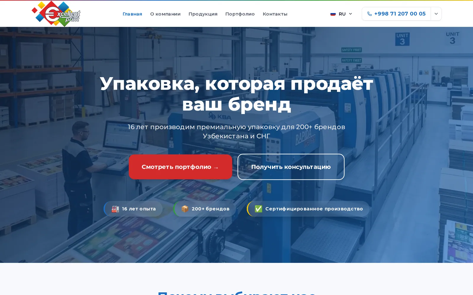
A good example of the right-hand column is Excellent Print, a packaging manufacturer in Tashkent. They needed a product catalogue, three languages, enquiries going straight into a Telegram group, and an admin panel where a manager adds products themselves. The front end is Next.js 15 with next-intl; the admin is Laravel with Filament. You could put that together in an AI builder too, but afterwards you'd have to redo roughly everything except the colours.
Do we use AI ourselves?
Yes, every day. The difference isn't the tool; it's who sets the task and who checks the result. When we use AI, it works from a detailed spec: which pages, which languages, which speed metrics count as acceptance, what must never be made up. And a person reads every file that comes out. Azamat describes how this works for us in his post on a year with AI assistants.
A builder gives you a first draft nobody has checked. Sometimes that's enough. If it isn't, a landing page with us starts at $800 and a corporate site at $2,000; details are on our web development page.
My advice is simple. If you need a site to test an idea, build it yourself in a builder and don't pay anyone. If the site has to bring in customers from search for years, plan a proper structure, languages and an admin panel from the start. Rebuilding later always costs more than doing it right the first time.