UX/UI design is not about making things pretty
Roughly every second brief I receive ends with “the main thing is that it looks beautiful.” It will. But if that's where the work starts, the site ends up like a great magazine cover on a magazine nobody opens.
 Murodjon MaxmudovDesigner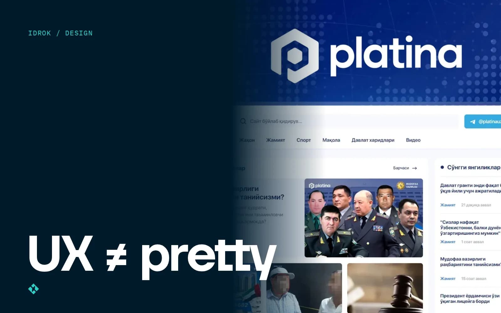
A year ago a client sent me three screenshots on Telegram: Apple's website, a landing page of some American startup, and an Instagram post with a gradient. The caption said: “Something like this.” The project was a business website where 80% of visitors arrive on a phone, through a link in a Telegram channel, and want to find the price and the address within a minute.
I have nothing against Apple. But none of those screenshots answered the question of what a person is supposed to do on the site. That's the difference between UI and UX, and I want to explain it without a textbook.
Pretty and usable are different jobs
UI (user interface) is what you see: colours, fonts, buttons, icons, spacing. UX (user experience) is the person's path: where they came from, what they're looking for, where they'll stumble and why they'll leave.
A simple test. Strip every colour and picture from the mockup and leave grey rectangles. Is it still obvious where to tap? If not, no gradient will save it.
I work on both sides. I draw logos and brand books, but on websites more than half my time goes into things the client never ends up seeing: page structure, block order, button labels, what happens after a tap. To the client it looks like “preparation.” It's actually the main job.
What I do before opening Figma
My process hasn't changed much in two years. Only the length of each step changes: research takes a day for a landing page and a week for a platform.
- Talk to the owner. Not about colours, about people: who comes, from where, in which language, on what device. In Tashkent the answer is almost always “on a phone, from Telegram or Instagram.”
- Other people's sites. I look at 5–10 competitors, including bad ones, and write down what annoys me as a visitor. It's faster than any survey.
- User flow. I draw the path with arrows: the person came from an ad → saw the price → tapped “Message us on Telegram.” If the path doesn't fit into 3–4 steps, something is extra.
- Wireframes. Grey blocks, no styling. At this stage the client argues about content, not about whether they like blue.
- Clickable prototype. I show it to 3–5 people who resemble future users. Often they're the client's relatives or staff, and that's enough to catch the rough mistakes.
- UI. Only now colours, typography, illustrations, motion. Plus a design system: buttons, inputs, cards, so the frontend developer doesn't have to guess the spacing.
Clients like step six the most. The first five are the ones that save them money.
Platina: a news site where reading comes first
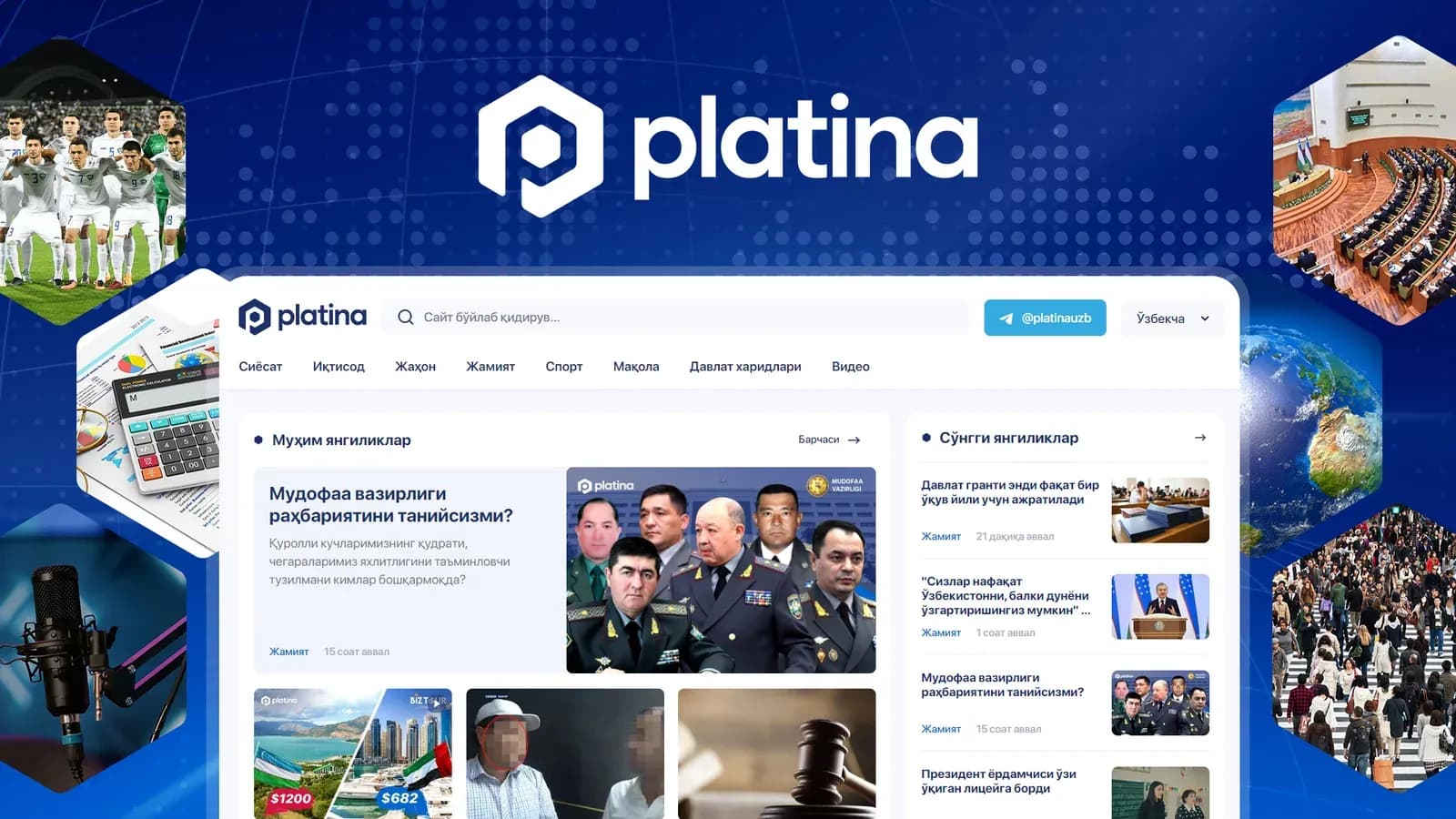
For Platina (the client is Media Affairs) we did the logo, the UX/UI and the news site itself. Sections: politics, economy, science, culture, sport. There's a lot of news, it updates daily, and readers come to read a specific story, not to admire the layout.
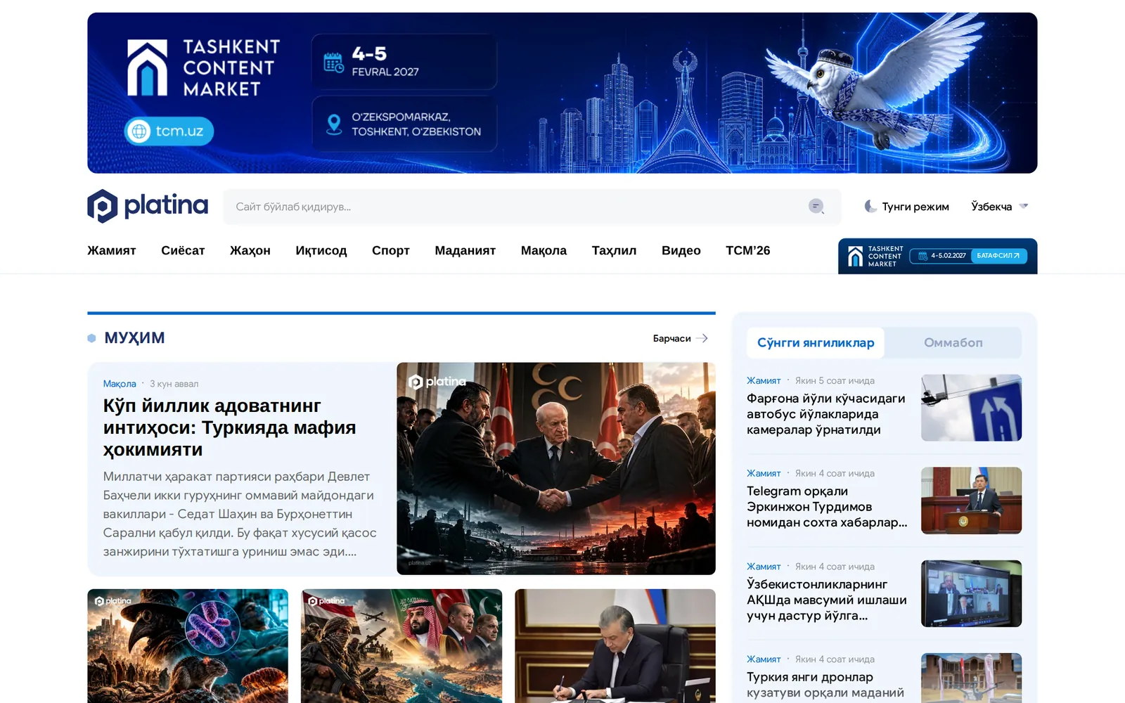
The main decisions had nothing to do with beauty:
- Homepage hierarchy. One lead story, then a few important ones, then the feed. When everything is the same size, the eye doesn't know where to go.
- Typography for long text. Line length, line height, font size on a phone. For a news site this matters more than any illustration.
- Sections as navigation, not decoration. Someone reading about sport should get to sport in one tap, not scroll through politics.
- The news card. Date, section, headline, preview. Every element sits in the same place across all lists, so the brain doesn't have to re-adjust.
We designed the logo in parallel and tested it inside the site header and as a tiny browser-tab icon rather than on a white sheet. I'll write about logos separately.
PlanBaby: when the user is anxious
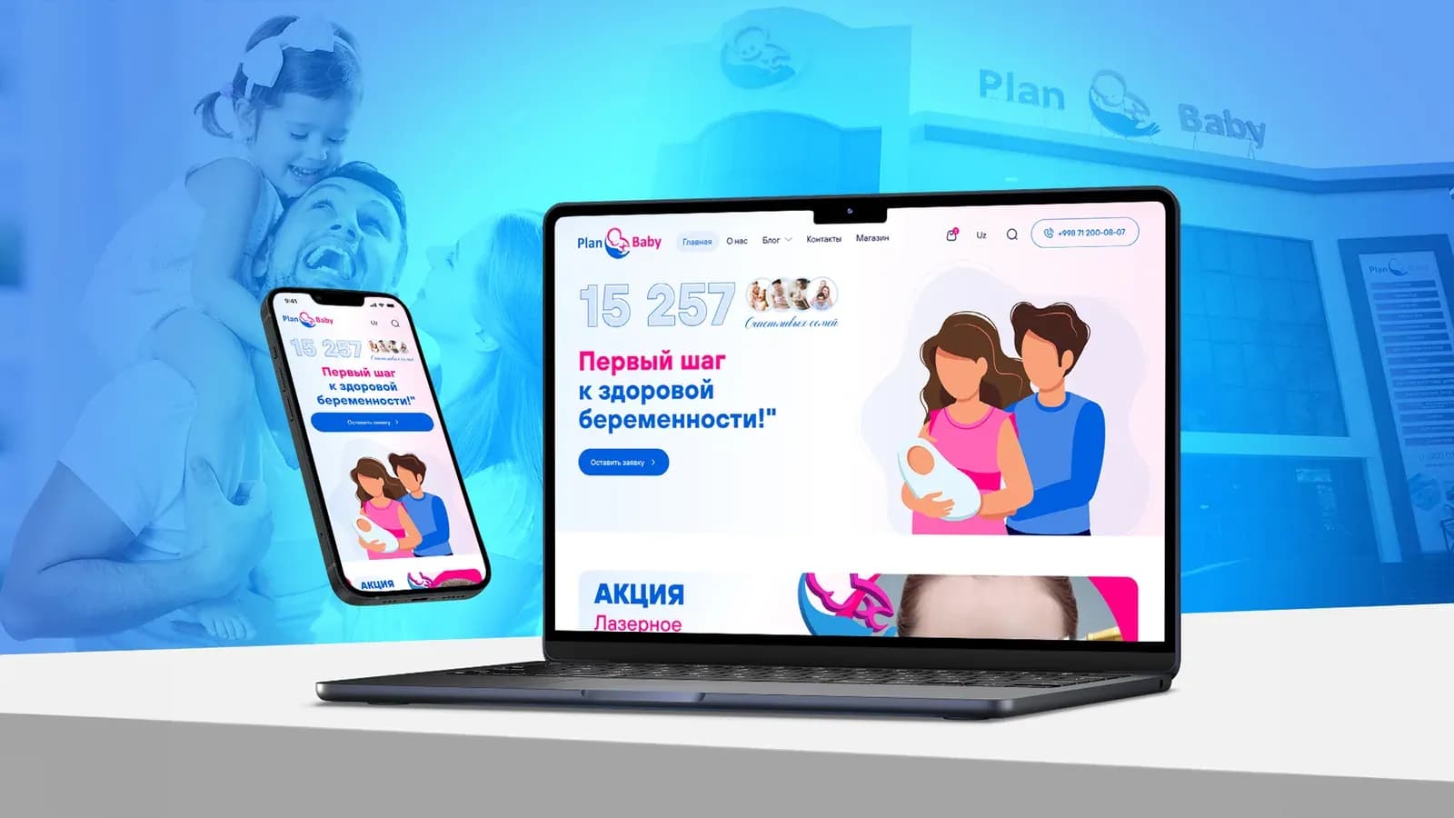
PlanBaby is a platform about pregnancy planning and parenting, with an online shop and a clinic. Here UX was about something else: a person looking up ovulation or test results is often worried. They don't need bright banners or discount pop-ups.

What we took into account:
- Mobile first. People read the articles in the evening on their phones, so I started the layouts at 375 px and stretched to desktop afterwards.
- Tools separate from articles. The ovulation calculator, the baby-name database, the semen-analysis explainer. That's what people come back for, so the tools have their own menu section.
- Sections by life stage. Planning, pregnancy, preparation, feeding. A person finds themselves in one word instead of a complicated category tree.
- The shop doesn't drown the content. There's a catalogue and a cart, but articles don't turn into product ads.
- Two languages, no bias. Uzbek and Russian texts differ in length, and buttons have to survive both without breaking the line.
To be honest, we overdid the shop at first. In the early mockups product blocks sat in almost every article and the page looked like a marketplace. After a discussion with the team we removed half of them. It was the right call.
“As a developer, a good mockup for me is one where every state has a screen: an empty list, an error, loading, a long Uzbek name. Without that, the programmer makes the decisions, and programmers usually pick whatever is quickest to build.”
What bad UX costs
A bad interface rarely breaks loudly. It just quietly loses people. These are the symptoms I see most often on sites that come to us for a redesign:
| Symptom | What the business loses | How we usually fix it |
|---|---|---|
| “Contact us” button only in the footer | Mobile leads, people don't scroll that far | A sticky Telegram button on mobile |
| Prices hidden or “on request” everywhere | Trust, people leave for sites that show prices | A “from…” range at least for the main services |
| A 10-field form | Leads at the very last step | Name and Telegram, the rest gets clarified in chat |
| Text baked into images | Search, translation, readability on phones | Text as a separate layer over the image |
| A 12-item menu | Time, people can't find what they need | 5–6 items, the rest in sub-sections |
None of these is about something being “ugly.” They're all about nobody drawing the user's path in advance.
How to tell if a designer does UX or just pictures
If you're choosing a designer or a studio, ask a few questions. The answers tell you right away who you're dealing with.
- Do they ask where your customers come from and on which devices?
- Do they show wireframes, or jump straight to a bright finished mockup?
- Is there a mobile version in the mockup, from the start and not “later”?
- Are error and empty states designed?
- Can they explain why a block sits exactly here without saying “it looks nicer”?
Price plays a part too. Our UI/UX design starts at $600, and most of that goes into structure and the prototype. If someone offers you “website design” for $100, you'll most likely get only step six from my list.
If I were writing this for myself five years ago, I'd say one thing: don't fall in love with the first mockup. Grey rectangles first, then the argument about meaning, and only then colour. You can see how this plays out in the Platina and PlanBaby case studies, and how we approach interfaces on the UX/UI design page.