How we designed logos for Solnechny TV, MiMi TV and Platina
A TV channel's logo lives in the most awkward place possible: in the corner of the screen, over any picture, the size of a fingernail. In 2023 I designed three media logos and realised that half the techniques from “regular” branding don't work here.
 Murodjon MaxmudovDesigner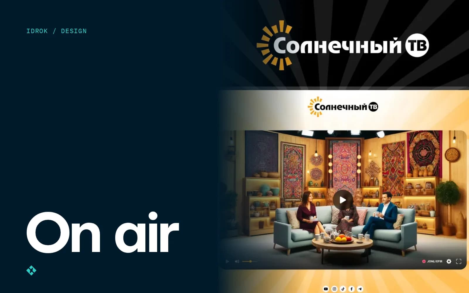
The first time I placed a logo sketch over a frame from the broadcast, it vanished. On the white background in Figma it looked great: thin lines, a neat typeface, a gradient. Over a frame with a bright sky, all that was left was grey noise.
Since then I test every media logo not on a white sheet but on a dozen random frames. That's the first thing that separates a TV channel logo from a logo for a café or a law firm.
How a channel logo differs from a regular one
A company logo usually gets to control its background: a business card, a sign, a website. A TV channel has no background. The logo sits in the corner of the screen for the entire broadcast, and everything passes underneath it: news, cartoons, concerts, dark scenes, white snow.
That leads to a few requirements I now write into the brief on day one:
- it has to read at a very small size, because in the screen corner the logo takes up a tiny part of the frame;
- it needs a single-colour version, usually white and semi-transparent, that doesn't fight the picture;
- it has to work in a square: a Telegram channel avatar, a YouTube icon, the site favicon;
- it has to move: intros, transitions, promos.
That last one is often forgotten. A static logo is only half the job for a channel.
What the process looks like
The stages were the same for all three projects; only the emphasis changed.
- BriefWho the viewers are, which channels compete, which languages they broadcast in, where the logo will appear besides the broadcast
- ReferencesI collect 20–30 channel logos, including foreign ones, and sort them by approach: symbol, wordmark, combination
- SketchesPencil and straight into Figma, 15–25 options. The client sees 3; the rest stay with me
- Frame testEach option goes onto 10–15 random frames: light, dark, busy. Half of them get cut
- RefinementLine weight, proportions, single-colour and square versions, SVG for the website
- Motion and guideA simple reveal animation and usage rules: clear space, colours, what not to do
The frame test is the most useful stage and the least pleasant. Options everyone liked sometimes fail right there.
Solnechny TV: a letter instead of the sun's disc
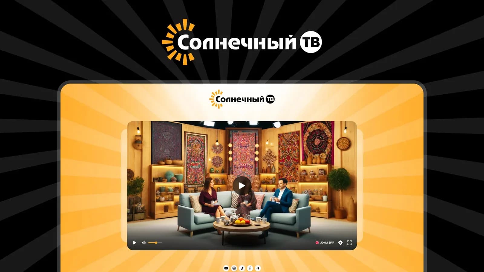
Solnechny TV (“Sunny TV”) is a Russian-language TV channel from Uzbekistan. We designed the logo and a live-stream website that runs on three domains: telekanal.uz, solnechniytv.ru and solnechniytv.kz.
The name was literally asking for a sun, and that was the first problem. The sun is one of the most worn-out images in logo design: hundreds of companies, from travel agencies to juice makers, use a circle with rays.
We dropped the circle. In the final mark the sun has no disc: the first letter of the name does that job. Short orange rays surround the Cyrillic “С,” and the word “Солнечный” seems to come out of the sun. At small sizes the eye completes the sun on its own, and the gaps between the rays let the picture underneath show through, so the mark doesn't turn into an orange blob in the corner of the screen. We moved “ТВ” into a dark round badge that can be shown on its own when space is really tight.
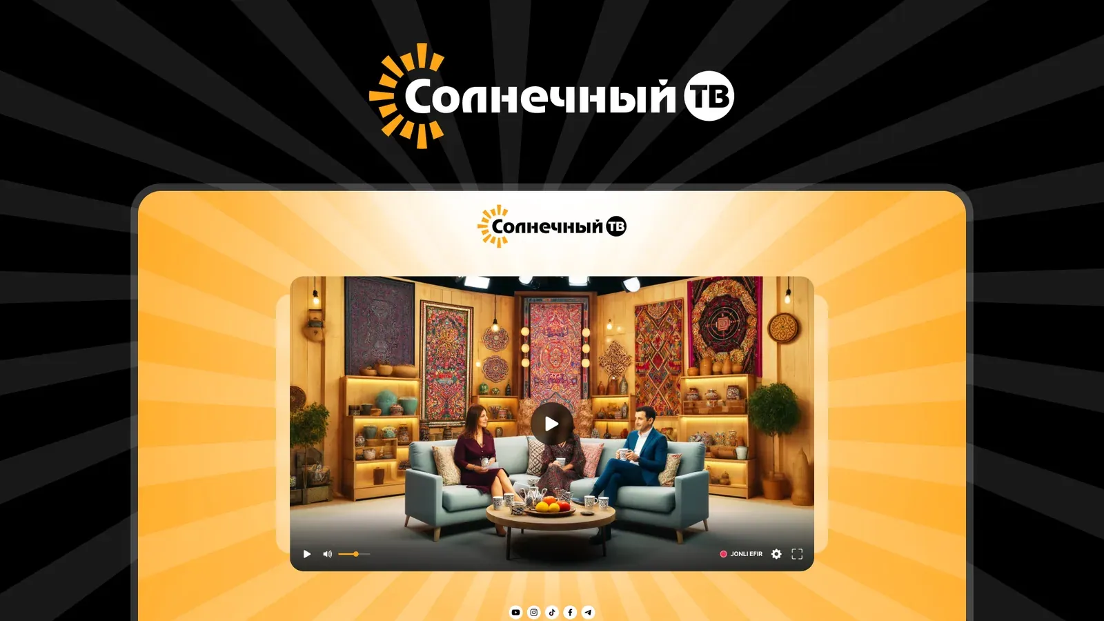
Colour took more fiddling than shape. Too yellow gets lost on bright frames; too red looks alarming. A warm orange with black lettering holds up on a light background and next to the dark player, and on the website we carried it into a background of radiating rays.
MiMi TV: a kids' channel without the kindergarten look
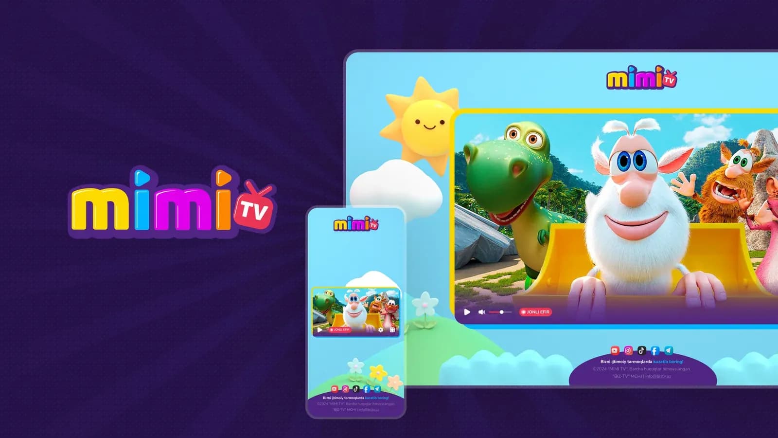
MiMi TV is a children's channel. Here the brief was the opposite: bright is allowed, even required. But “bright” for a kids' channel easily turns into six typefaces and a rainbow.
We kept the brightness and limited everything else. One letter shape: thick, rounded, almost inflated. Each letter in its own colour: yellow, light blue, magenta, orange. And most importantly, a thick dark-purple outline around the whole word. The outline is what solved the screen-corner problem: over a busy cartoon, coloured letters without a stroke would merge with the picture, while with the outline the word reads on any background. “TV” became a small red TV set with an antenna, tilted at the edge of the word.
MiMi taught me one thing: a kids' logo isn't looked at by kids but by parents searching for the channel in a list. So the name has to read instantly, not be guessed from a picture.
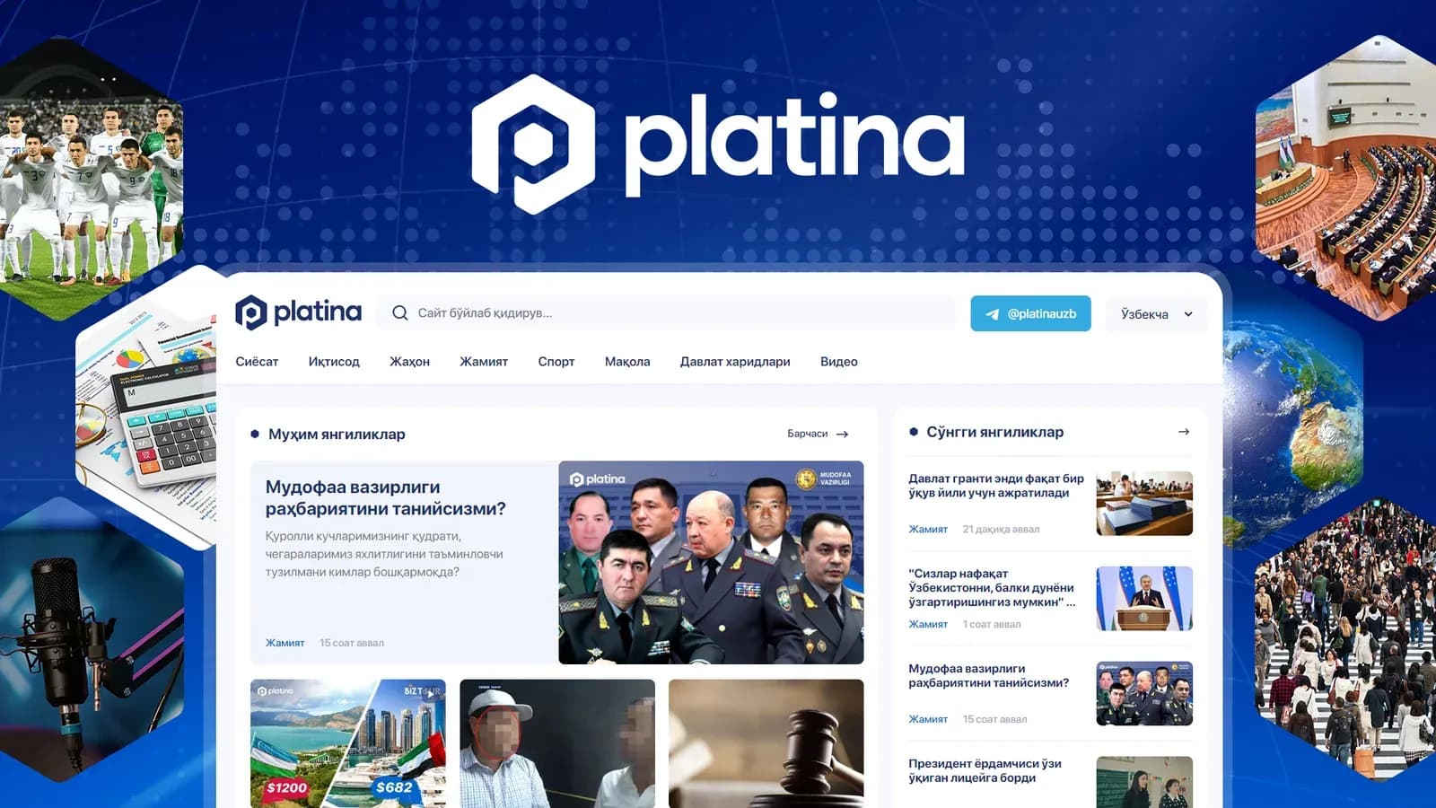
Platina: a mark that doubles as a watermark
Platina is a news site, not a TV channel, but the problems are similar: the logo lives in the header, in social previews, on the Telegram channel avatar. And in one more place clients don't think of right away: on news photos. The newsroom puts the logo in the corner of its images, so pictures that spread across Telegram channels keep showing the source.
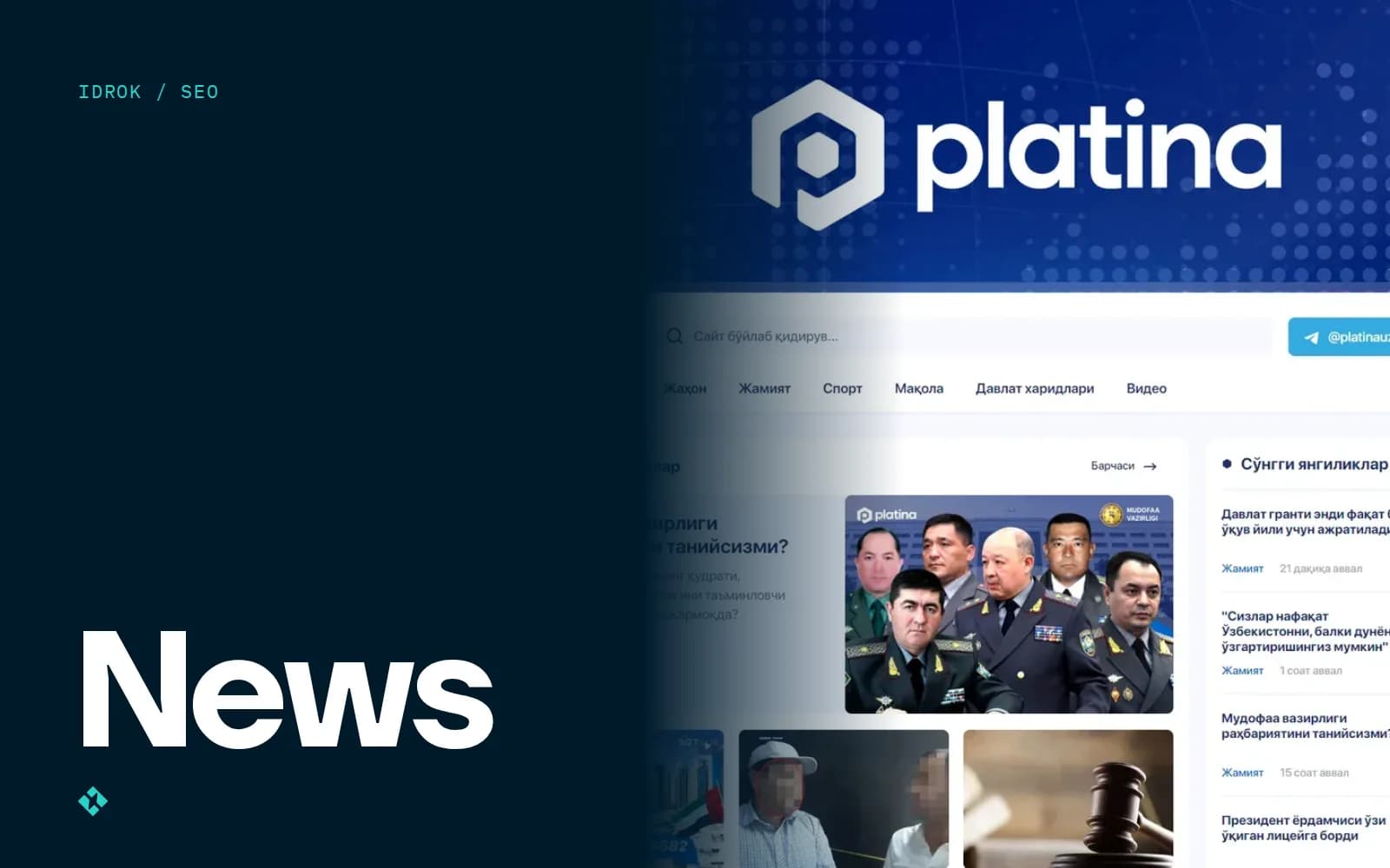
That's why we gave Platina a combination logo: a symbol shaped like the letter “P” inside a dark-blue geometric form, with the name in lowercase beside it. The symbol works on its own as an icon and avatar, and the white version of symbol plus name sits in the corner of any photo.
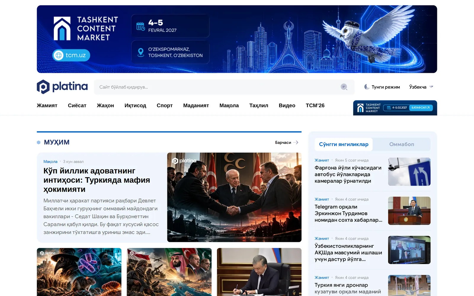
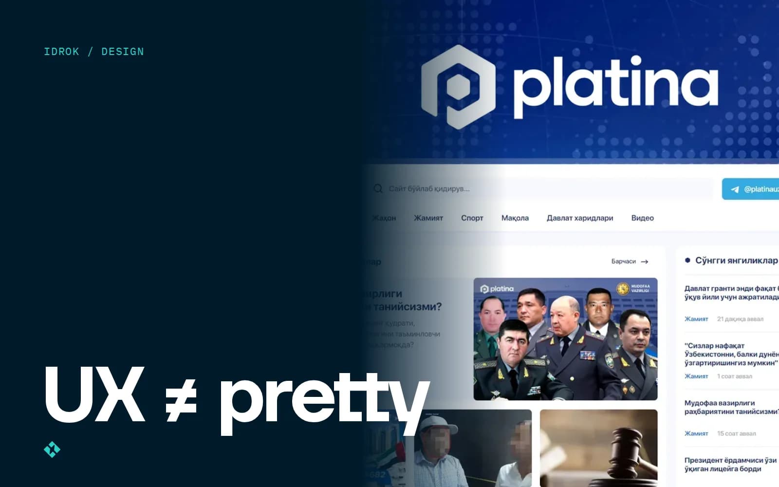
We designed the logo together with the UX/UI and the site itself, so we tested the mark inside the real interface from the start rather than on its own. I wrote more about the interface side in the piece on why UX/UI isn't about making things pretty.
“When the designer hands over the logo as SVG right away, in light and dark versions plus a square variant for the favicon, I drop it in within ten minutes. When a PNG with a transparent background arrives, a two-day conversation begins.”
The brand book: why you need it if you already have a logo
A logo without rules lasts about six months. Then the SMM person stretches it across a banner, someone puts it on a red background, and the signage contractor draws his own “similar” version.
A brand book fixes that. We made brand books for SMM Maktab, free nationwide SMM courses across Uzbekistan, and for the law firm Legal Alliance. Their tasks are completely different, but the set of sections is almost the same:
- Primary, single-colour and inverted logo versions
- Clear space and minimum size
- Colours in HEX, RGB and CMYK so screen and print match
- Typefaces and rules for setting headlines
- Examples of misuse: stretching, rotating, recolouring
- Post templates for Instagram and Telegram, covers, avatars
- For media: rules for the on-screen corner logo, intros and captions
For SMM Maktab, I think the most valuable part is the social media rules: the courses run in different regions and different people make the materials. Without shared rules every region would draw its own SMM Maktab.
What it costs and what I'd do differently
Our logos start at $400, brand books at $1,200. For a TV channel I almost always recommend doing both at once: the broadcast, the website and social media should look the same from day one.
What would I do differently? Start on motion earlier. In our 2023 projects we thought about movement at the very end, once the shape was already approved. You can always animate a finished mark, but the ideas that come specifically from motion don't show up at that stage. Now I draw the first sketches already thinking about how the logo will appear on screen.
You can see the logos at work in the Solnechny TV, MiMi TV and Platina case studies.