Why sending ads to your homepage burns the budget
When a client says “the ads aren't working”, the first thing I open isn't the ad account but the link in the ad. Half the time it leads to the homepage, and there's no need to look further.
 Murodjon MaxmudovDesigner
I'm a designer, and ad accounts are not my territory. But the studio has a habit: if ads bring clicks and no leads, the link from the ad gets shown to me first. The problem is almost always visible in ten seconds, before any analytics.
Someone searches for "Islamic finance course for business", taps the ad and lands on the training centre's homepage. There's a news slider, five programmes, a mission statement, partners, photos from graduation. The course they wanted is somewhere in the menu, second level down. That person paid you with their attention for one specific thing, and you showed them everything else.
The homepage answers every question and none of them well
A homepage is built for people who came to you by name. They already know the company and want to look around. A visitor from an ad is different: they came with one question and give the page a few seconds to show them they're in the right place.
On a homepage they have to dig for the answer themselves. Every extra menu click loses some of them, and every lost visitor is a click you've already paid for. That's why ads should almost never point to the homepage. You need a page built for a specific intent: one query, one offer, one action.
It doesn't have to be a separate "landing page" on a separate domain. Sometimes a good service page on the main site is enough. What matters isn't where it lives but what the first screen says.
One page, one query
Advertisers call it message match: the page headline should echo what the person searched for and what the ad said. If the ad says "Islamic finance course, starts in June, in person in Tashkent", the first words on the page should be about that course, June and Tashkent. Not about "a leader in education".
Before launch I go through this list:
- The first-screen headline repeats the query and the ad almost word for word
- What it is, who it's for, where and when are visible without scrolling
- There is one main button, and it's visible on a phone without scrolling
- The page language matches the ad: an Uzbek ad leads to the Uzbek version
- A price, or at least "from", is shown if every other chat asks about it
- No menu that leads off to other courses or services
- The form is short: name and phone, the manager can ask the rest
- Under the form it's clear what happens next: "we'll call you" or "we'll message you on Telegram"
The language point gets underestimated. In Uzbekistan an ad in Latin script that leads to a Russian page loses people immediately. And many older users respond better to Cyrillic Uzbek than to Latin. We wrote more about this in our post on three-language websites.
How the Mezon Ta’lim landing page is built
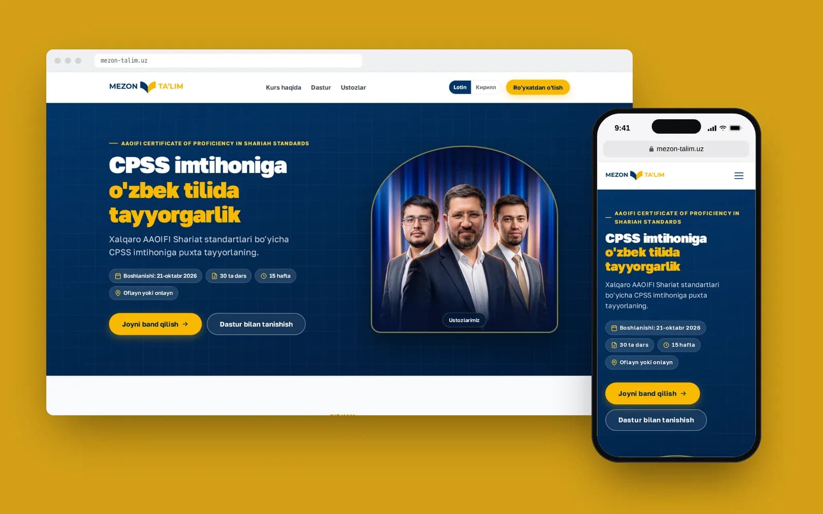
A good example from our work is the landing page for the fourth intake of the course "Biznesda Islom moliyasi" (Islamic finance in business) at the Mezon Ta’lim training centre. The centre has a main website, but for ads and broadcasts we built a separate page about this course only.
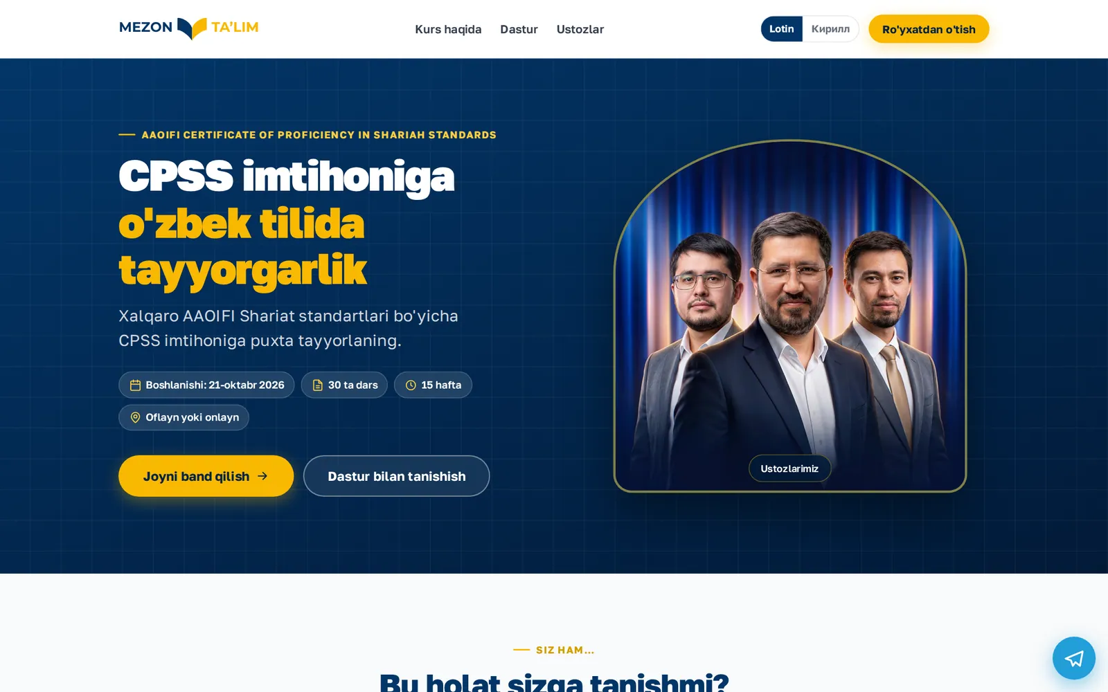
The structure, top to bottom:
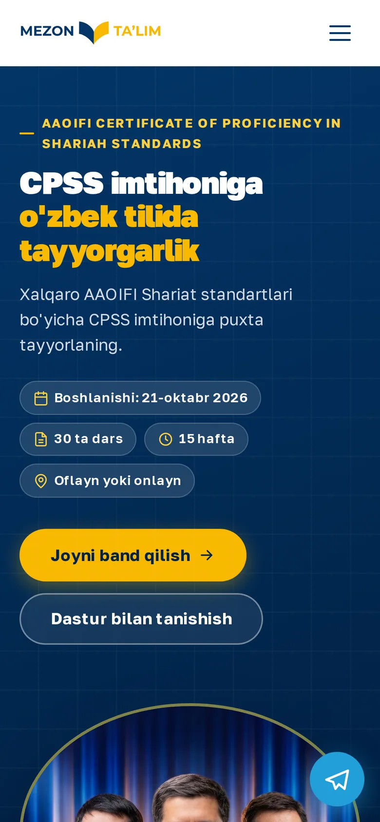
- First screen. Course name, season number, short badges: start date, 14 sessions, 7 weeks, in person in Tashkent. One main button, "Reserve a seat", and a second, quieter one, "See the programme".
- Pain points. Four questions a prospective student already asks themselves: are they sure about the contracts they sign, how to avoid mistakes in partnership deals.
- Outcomes. What the person will be able to do after the course. In the same plain language, without "in-depth immersion in the subject".
- Course facts. Dates, days of the week, class times, duration. Exactly what people would otherwise ask on Telegram.
- Programme. Four modules, 14 lessons, short and to the point.
- Instructors and video testimonials. Trust is built here, not by the word "best" in a headline.
- Prices and the form. Name and phone. That's it.
The page exists in two scripts: Latin and Cyrillic Uzbek. Different ad campaigns point to each version, and every lead that arrives in the centre's Telegram group shows which script the person came from, which page, and which UTM tags. For the sales team this beats any CRM: the lead, its source and the Tashkent time in one message.
One more detail I like to show: after submitting the form, the person isn't left staring at "Thank you". They're immediately offered a "Message us on Telegram" button. Some people want to ask a question now rather than wait for a call, and this step catches them while they're still warm.
A form that isn't scary to start: IBN Express
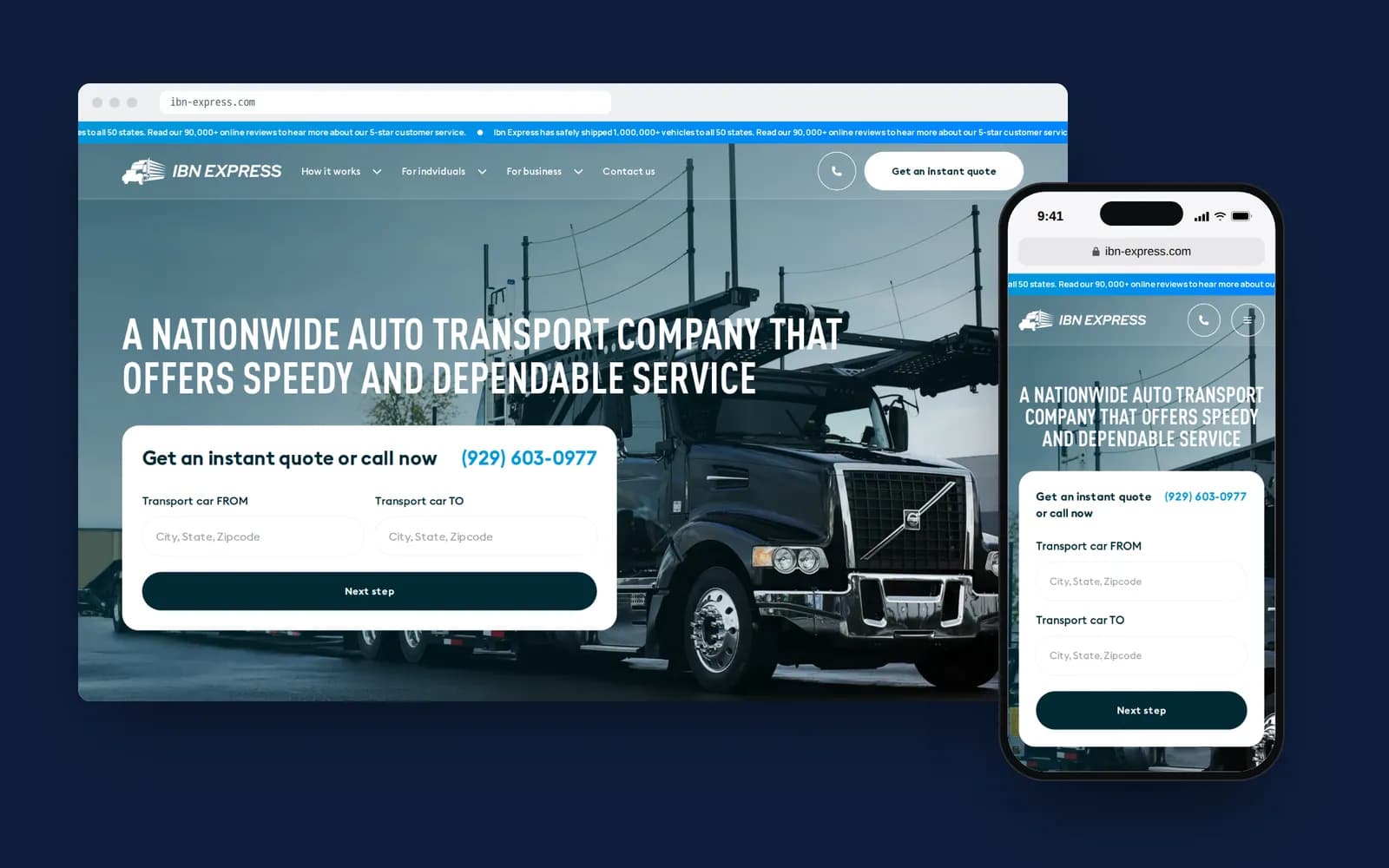
The other extreme is forms where you fill in twelve fields to find out the price. IBN Express, a US car-shipping company, genuinely needs a lot of fields. To quote a shipment you need origin and destination, the car's year, make and model, transport type, whether the car runs, the ship date and contact details.
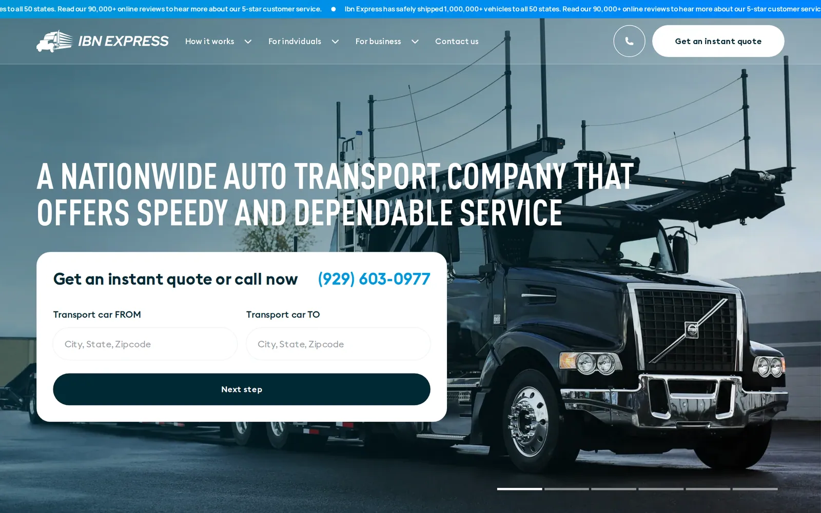
We didn't show it all at once. The form is split into four steps, and the first one is the easiest: two ZIP codes, from and to, with autocomplete for US ZIPs. The person types five digits, sees a suggestion, taps "next". Then the car, then the transport type, and only at the end the date and contacts. By the time they're asked for a phone number, they've already invested a minute in the form and want to see the result.
The lead is saved to the database and at the same time pushed to the sales team's Telegram channel with every parameter. The manager sees not just "new lead" but the route, the car and the date, and can call back with an answer ready.
Speed on a phone
Almost all ad traffic in Uzbekistan comes from phones, and not always over good 4G. If the first screen takes five seconds to load, you've paid for part of your clicks for nothing: the person closed the tab before it finished.
What I build into the mockup as a designer, so developers don't have to fight it later:
- one image on the first screen, not a five-slide carousel;
- WebP images sized sensibly for phones;
- video testimonials below the first screen, loading on tap rather than autoplaying;
- a font with Cyrillic and Uzbek characters (o‘, g‘), but one or two weights, not six;
- no pop-ups in the first seconds. If someone came for a course, a newsletter pop-up only annoys them.
One button
The hardest part of working on a landing page is persuading the client to remove things. They want a link to Instagram, to other courses, to the YouTube channel, a phone number, a WhatsApp button. Each of those links looks harmless on its own. Together they turn a one-action page into an eight-action page.
“Every time someone asks to add one more button to a landing page, I ask: which of the existing ones are we removing?”
We usually keep one main action (the form or Telegram, depending on how the client's sales actually work) and one fallback. Nothing else.
What I check five minutes before launch
I open the ad on my own phone, over mobile data, not the office Wi-Fi. I tap it. I count the seconds until it's clear what the offer is and where to tap. I send a test lead and check that it arrived in Telegram and that the tags are there.
It sounds too simple to be useful. But this is the step where we've found the most problems: a button that slid under a photo on a small screen, a form that won't submit from Instagram's in-app browser, a link from an Uzbek ad pointing to the Russian page.
If you count leads by Telegram clicks rather than forms, Mirodil has written up how to set that up. And if you need a landing page for your ads, it's one of the things we do as part of Google & Yandex ads management.